Saint Petersburg Transit Cards
A unified visual concept and ready-to-print layouts developed for a line of transit cards.
Year
2026
Scope
Graphic Design
Client
Government of Saint Petersburg (Transport Committee)
Duration
3 weeks
A unified visual concept and ready-to-print layouts developed for a line of transit cards.
Challenge
The existing transit card design was perceived as a formal document — something purely administrative, rather than a natural part of the city's transport infrastructure. Mismatched typography and an excessive color palette created visual noise, making it difficult for passengers to focus on what matters: clarity, functionality, and a seamless travel experience.
The goal was to transform this fragmented collection of cards into a cohesive family — one that balances functionality with aesthetics, respects the city's identity, and makes every passenger's journey just a little bit easier.
Results
I approached this project not as a card redesign — but as a chance to tell a story. The story of Saint Petersburg and the people who move through it every day. The guiding idea: "Petersburg and I: there's chemistry between us."
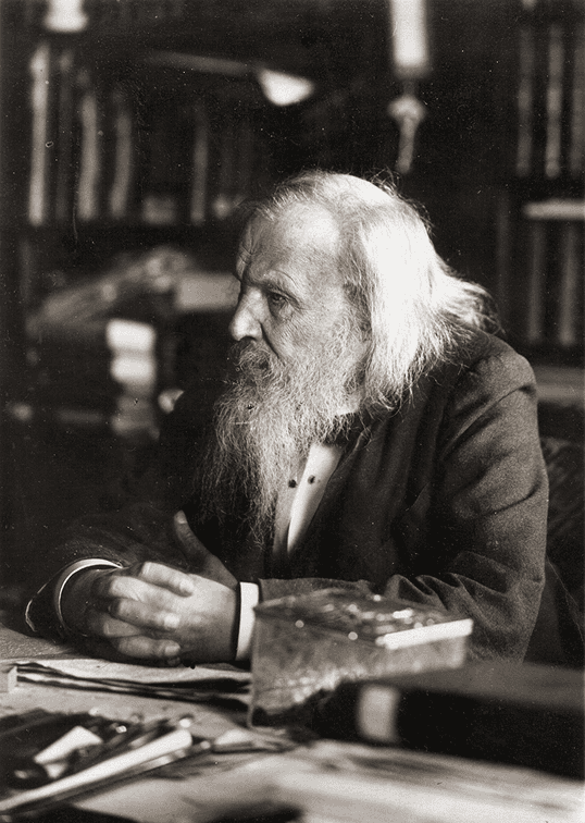
A nod to Mendeleev — Dmitrii Mendeleev, the father of the periodic table, called Saint Petersburg home for most of his life. His legacy runs through the city's veins — and now, through its transit cards. The design carries this quiet tribute, connecting science, history, and everyday life.
The chemistry of movement — Our daily routes are made of places and the connections between them — just like atoms and bonds in a molecule. The card's visual system mirrors this structure, turning each journey into a beautiful, logical, and deeply human pattern.
More than a ticket — This card is a piece of the city. A small, everyday artifact that reminds passengers they're part of something bigger — a living, breathing network of people, places, and stories.
One family, many faces — Instead of a chaotic mix of card types, I built a unified system: consistent typography, a refined palette, and a layout that prioritizes clarity without sacrificing character.